The Japanese candlestick chart is still one of the important weapons in the arsenal of a technical analyst. If you are a pure price action trader, you can make mighty profits just by analyzing candlestick charts of a stock or commodity. In this post, we’ll learn how to plot a candlestick chart in an excel sheet. You won’t need any external tool or plugin to do that, excel already has an inbuilt feature that you can leverage.
Also Read: How to calculate XIRR in an Excel Sheet?
What is a Candlestick Chart?
In a candlestick chart, the open, high, low and close prices of security are evenly organized into individual ‘candles’. Each candle has a thick body which represents open and close prices, and upper/lower wicks which represent high and low price.
When the body is filled in or red-colored, it means close is lower than open. And if the body is empty or green colored, it means close is higher than open.

Each candle in the chart may represent a unit of time, like a day, week, month, etc. Traders generally look at various patterns in a candlestick chart to judge the bullishness, bearishness and momentum of the security.
How to plot a Candlestick chart in Excel Sheet?
Follow the below steps to plot a candlestick chart in an Excel sheet. These instructions hold relevant for Microsoft excel 2019 but should be more or less true for other versions of Excel also.
Step 1: Organize the open, high, low, close data into Excel columns along with the timestamp. Make sure the data is ordered in that way and arranged in ascending order of dates.

Step 2: Select the columns which contain open, high, low and close data.

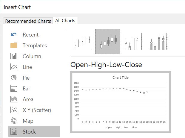
Step 3: Go to Insert menu –> Recommended Charts –> All Charts –> Stock. Select the second option which says Open-High-Low-Close.
Step 4: A candlestick chart would be automatically generated. Drag it to the required coordinates. You can even cut-paste it in another worksheet.

As you can see the candlestick chart is not properly formatted yet. In the next steps, we’ll format the chart and make it more presentable.
Step 5: Click on the chart, right-click and choose ‘Select Data’ form the menu. In the ‘Chart Data Range’ option, you’ll see the range of cells where your price data is stored. You may edit it in case your range is different.

Step 6: Click on the Edit button below ‘Horizontal (category) Axis Labels’ option. Select your data column so that it appears in the ‘Axis label range’. Click on ‘OK’

Step 7: Uncheck the ‘Date’ checkbox under ‘Horizontal (category) Axis Labels’ and click OK.

Step 8: Now the Dates would appear in the horizontal axis. Right-click on the horizontal axis, click on the format axis and under axis options select the bullet ‘Text axis’. This is to make sure that any missing dates (like a weekend) are not displayed in the chart.

Step 9: Right-click on the vertical (price) axis. Click on format axis, and under axis options set up the minimum and maximum bounds and units. This setting depends on your price data.

Step 10: Change the chart title and delete the legend at the bottom.
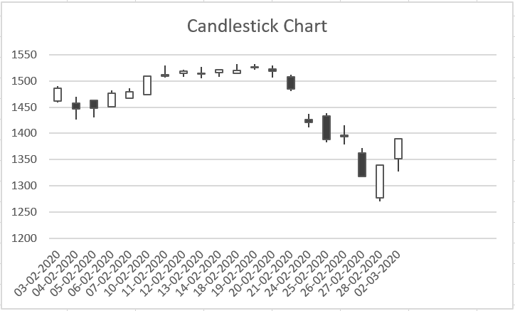
Step 11: From the design menu in the top select your desired template to make the chart more attractive.

Also Read: Most powerful candlestick patterns you must know
Download Excel Sheet
Download the excel sheet to plot candlestick charts from the below link:
Plot a Candlestick Chart- Trading Tuitions
